
Mastering Dark Mode in SwiftUI is an essential skill for modern iOS developers, offering a sleek, user-friendly interface for app users. Since its debut in macOS Mojave and subsequent adoption in iOS, Dark Mode has transformed app aesthetics, providing both challenges and opportunities for developers. This guide is tailored for beginners who are keen to learn the nuances of implementing Dark Mode in their SwiftUI apps. From the basics to more intricate implementations, we will navigate the SwiftUI framework to ensure your app looks stunning in both light and dark environments.
As Apple continues to innovate, features like Dark Mode have become more than just a visual preference; they are part of an inclusive design philosophy that enhances accessibility and comfort for users across all their devices. Whether you’re new to Dark Mode or looking to refine your existing knowledge, this article will equip you with a straightforward, step-by-step approach to integrate Dark Mode into your SwiftUI projects, ensuring a seamless user experience.
I’m assuming that you have experience with Swift and Xcode 12. However, If you have no experience in these tools, take some time to read about them here.
Supporting Dark Mode
The prospect of supporting Dark Mode on a complex and top-rated app can be daunting! If it hasn’t been a priority for your team or business until now, the scale of changing every view and ensuring that it looks good on every device can be off-putting.
Thankfully, the framework already does a lot for you. If you haven’t already, try it in the previewer, and see how the app reacts to it. Views like ScrollView, Form, List, Buttons, Text, and the like already respond well unless you’ve specified some customization on them.
But what if you’re just looking to implement your app, and you want to make sure you have Dark Mode support right off the bat? In that case, let’s create a simple form app. Even if that isn’t the situation you’re in, you can see along the way how to make the correct modifications to support Dark Mode in your existing project.
Dark Mode Sample
Now that you’ve got a better understanding of what you can accomplish with Dark Mode in your app, let’s test it on the previewer with your “Hello World!” code.
To see your app in Dark Mode, just add the following code to the ContentView_Previews() method.
struct ContentView_Previews: PreviewProvider {
    static var previews: some View {
        ContentView().preferredColorScheme(.dark)
    }
}
This simple change gives you the following:
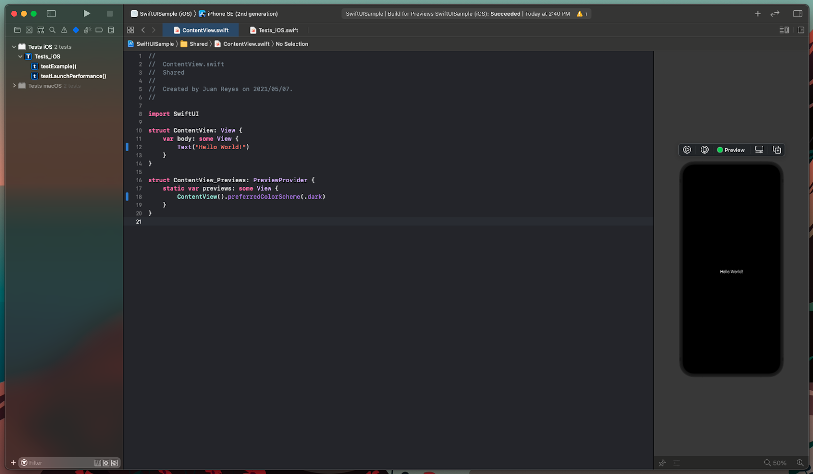
Great! That was easy, right?
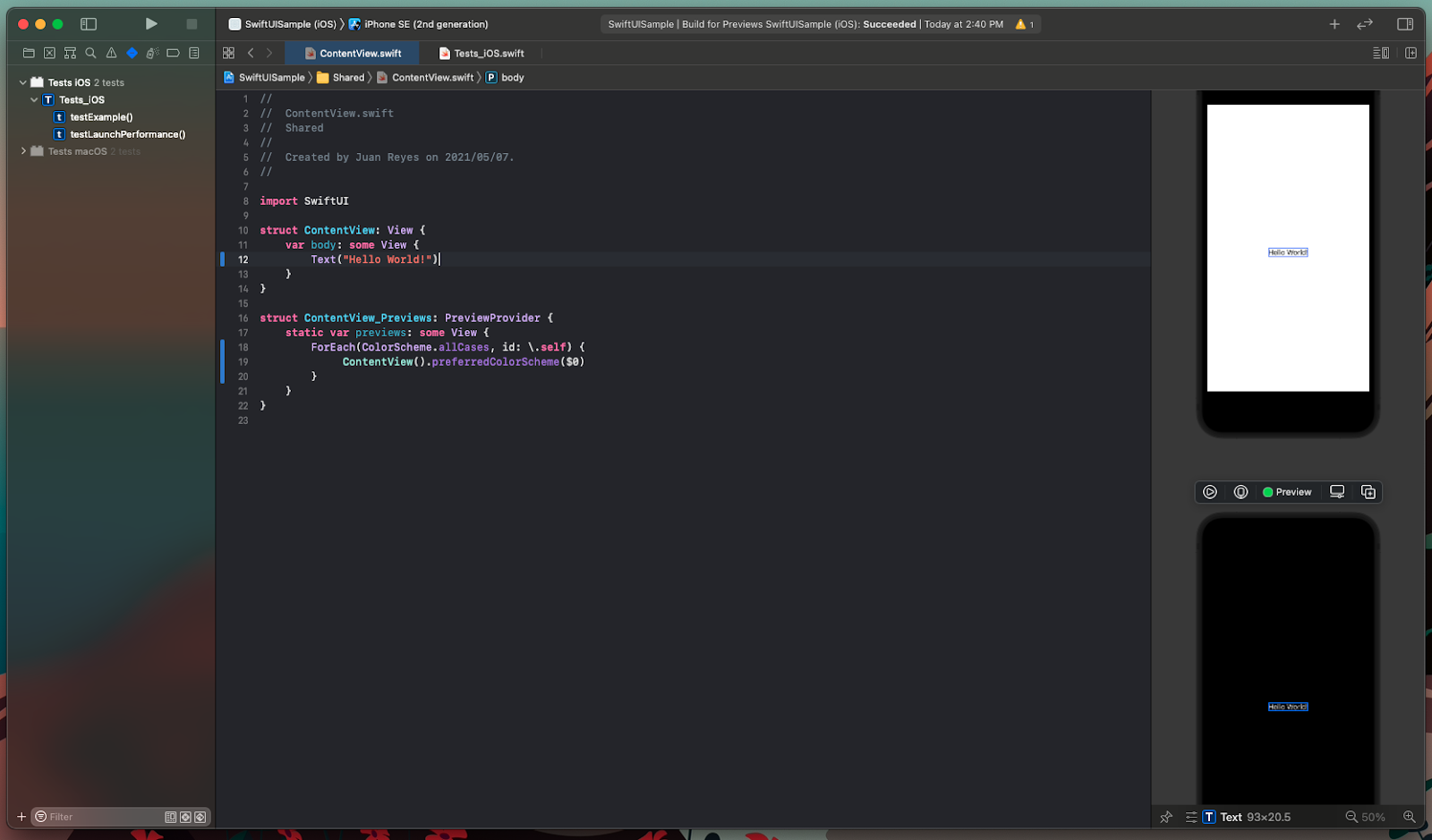
Now, ideally, you’d want to have both light and dark representations of the preview so you can save some time. To do this, let’s modify the code a little bit.
struct ContentView_Previews: PreviewProvider {
    static var previews: some View {
        ForEach(ColorScheme.allCases, id: \.self) {
             ContentView().preferredColorScheme($0)
        }
    }
}
That way, you get two previews stacked on top of each other so you can work more efficiently. Simple, right?
Moving on, let’s add some elements and put them inside a form. If you feel a bit lost when you look at the code below, I recommend you check our previous post on working with SwiftUI Forms.
import SwiftUI
struct ContentView: View {
enum Gender: String, CaseIterable, Identifiable {
case male
case female
case other
var id: String { self.rawValue }
}
enum Language: String, CaseIterable, Identifiable {
case english
case french
case spanish
case japanese
case other
var id: String { self.rawValue }
}
@State var name: String = ""
@State var password: String = ""
@State var gender: Gender = .male
@State var language: Language = .english
@State private var birthdate = Date()
@State var isPublic: Bool = true
@State private var showingAlert = false
var body: some View {
NavigationView {
Form(content: {
Section(header: Text("Credentials")) {
// Text field
TextField("Username", text: $name)
// Secure field
SecureField("Password", text: $password)
}
Section(header: Text("User Info")) {
// Segment Picker
Picker("Gender", selection: $gender) {
ForEach(Gender.allCases) { gender in
Text(gender.rawValue.capitalized).tag(gender)
}
}
.pickerStyle(SegmentedPickerStyle())
// Date picker
DatePicker("Date of birth",
selection: $birthdate,
displayedComponents: [.date])
// Scroll picker
Picker("Language", selection: $language) {
ForEach(Language.allCases) { language in
Text(language.rawValue.capitalized).tag(language)
}
}
}
Section {
// Toggle
Toggle(isOn: $isPublic, label: {
HStack {
Text("Agree to our")
// Link
Link("terms of Service", destination: URL(string: "https://www.example.com/TOS.html")!)
}
})
// Button
Button(action: {
showingAlert = true
}) {
HStack {
Spacer()
Text("Save")
Spacer()
}
}
.foregroundColor(.white)
.padding(10)
.background(Color.accentColor)
.cornerRadius(8)
.alert(isPresented: $showingAlert) {
Alert(title: Text("Form submitted"),
message: Text("Thanks \(name)\n We will be in contact soon!"),
dismissButton: .default(Text("OK")))
}
}
})
.navigationBarTitle("User Form")
}
}
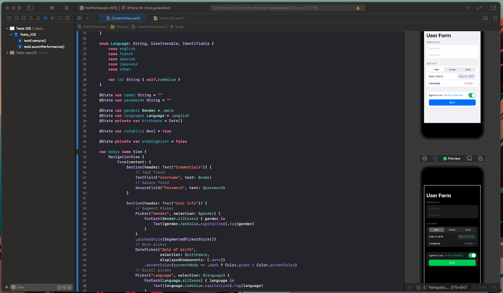
}Once you’ve implemented this, you can see that Swift is smart enough to display the elements in both Light Mode and Dark Mode without any work on your part.

As you can see, this is a straightforward implementation of the most common elements in a simple user form.
Pretty neat!
But what if you want to detect when Dark Mode is enabled and make custom adjustments to some views? Well, let’s see how you can detect the state of the environment.
Mastering Dark Mode in SwiftUI
Detecting the state of the environment to make customizations is pretty simple in SwiftUI.
Add a variable preceded by the @Environment clause with the colorScheme modifier.
@Environment(\.colorScheme) var currentModeIn my case, I called it currentMode, but you can call it anything you want.
This environment variable will inform your view of the current systemwide state of Dark Mode. Now, you can do customizations depending on the value, like this:
import SwiftUI

struct ContentView: View {
    @Environment(\.colorScheme) var currentMode

    enum Gender: String, CaseIterable, Identifiable {
        case male
        case female
        case other

        var id: String { self.rawValue }
    }

    enum Language: String, CaseIterable, Identifiable {
        case english
        case french
        case spanish
        case japanese
        case other

        var id: String { self.rawValue }
    }

    @State var name: String = ""
    @State var password: String = ""
    @State var gender: Gender = .male
    @State var language: Language = .english
    @State private var birthdate = Date()
    @State var isPublic: Bool = true
    @State private var showingAlert = false

    var body: some View {
        NavigationView {
            Form(content: {
                Section(header: Text("Credentials")) {
                    // Text field
                    TextField("Username", text: $name)
                    // Secure field
                    SecureField("Password", text: $password)
                }

                Section(header: Text("User Info")) {
                    // Segment Picker
                    Picker("Gender", selection: $gender) {
                        ForEach(Gender.allCases) { gender in
                            Text(gender.rawValue.capitalized).tag(gender)
                        }
                    }
                    .pickerStyle(SegmentedPickerStyle())
                    // Date picker
                    DatePicker("Date of birth",
                               selection: $birthdate,
                               displayedComponents: [.date])
                        .accentColor(currentMode == .dark ? Color.green : Color.accentColor)
                    // Scroll picker
                    Picker("Language", selection: $language) {
                        ForEach(Language.allCases) { language in
                            Text(language.rawValue.capitalized).tag(language)
                        }
                    }
                }

                Section {
                    // Toggle
                    Toggle(isOn: $isPublic, label: {
                        HStack {
                            Text("Agree to our")
                            // Link
                            Link("terms of Service", destination: URL(string: "https://www.example.com/TOS.html")!)
                                .accentColor(currentMode == .dark ? Color.green : Color.accentColor)
                        }
                    })
                    // Button
                    Button(action: {
                        showingAlert = true
                    }) {
                        HStack {
                            Spacer()
                            Text("Save")
                            Spacer()
                        }
                    }
                    .foregroundColor(.white)
                    .padding(10)
                    .background(currentMode == .dark ? Color.green : Color.accentColor)
                    .cornerRadius(8)
                    .alert(isPresented: $showingAlert) {
                        Alert(title: Text("Form submitted"),
                              message: Text("Thanks \(name)\n We will be in contact soon!"),
                              dismissButton: .default(Text("OK")))
                    }
                }
            })
            .navigationBarTitle("User Form")
        }
    }
}
This gives you the expected result:
Note: I added modifiers to some elements, depending on what I wanted to change to keep a cohesive style on the form.
You can go further and modify the appearance of the container form itself. And you can even create custom elements that respond to the selected scheme and the environment.
For further reading, check out Apple’s advice on supporting Dark Mode in your interface.
Now, let’s make sure that your work stays in order.
Testing Your Work
With a complete implementation of Dark Mode in your hands, it’s time to create some tests to ensure that your code is clean and works as intended. To do that, let’s work with Xcode’s UI testing framework, which is already bundled in the project.
Now, open the Test iOS folder, and double-click on the Test_iOS.swift class file. Once that’s open, you’ll see everything you need right there to start testing. Go ahead and run it.
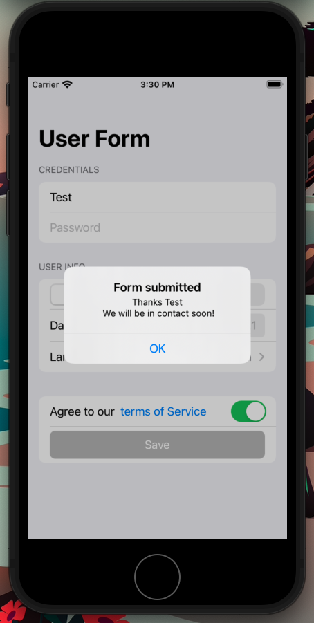
Once that’s done, to test that your code is working as intended, add the following to the testExample() function:
func testExample() throws {
    // UI tests must launch the application that they test.
    let app = XCUIApplication()

    app.launch()
    app.textFields["Username"].tap()
    app.textFields["Username"].typeText("test")
    app.textFields["Username"].typeText("\n")
    app.buttons["Save"].tap()

    XCTAssertTrue(app.alerts["Form submitted"].waitForExistence(timeout: 1))
    XCTAssert(app.alerts["Form submitted"].staticTexts["Thanks test\n We will be in contact soon!"].exists)

    // Use recording to get started writing UI tests.
    // Use XCTAssert and related functions to verify your tests produce the correct results.
}
Now, run that test. Check that the views respond accordingly and the alert displays. You can also change the state of the emulator to Dark Mode and see how it looks.
Excellent!
If you’re eager to do more testing, you can find additional info on testing in Xcode UI here.
Should You Implement Dark Mode?
Dark Mode is a convenient feature, and it certainly affects the user experience. However, it’s unlikely to be the factor that takes your application from good to great.
So, should you consider skipping Dark Mode? Well, it isn’t easy to say. Even though the process of implementing support for Dark Mode was pretty approachable and straightforward in this article, you might find some difficulties if you’ve got an extensive and complex project that has many people working on it.
If you’re starting a new project, then absolutely have Dark Mode support at the top of your list—especially if your app leans heavily on content consumption. However, what if you have an established project on your hands with a lot of code and a tight schedule? Then I’d say to sit on it until you decide to schedule a significant design change in your project.
Leave a Reply